
RadioGroup Button
-
Description
RadioGroup Button
RadioGroup Button is a visible component like Vertical Arragement and is used to create a multiple-exclusion scope for a set of radio buttons. Checking one radio button that belongs to a radio group unchecks any previously checked radio button within the same group.
Intially, all of the radio buttons are unchecked. You can select which RadioButton you want to check, with the property 'Checked Button' and unckeck using the method 'Clear Checks'.
-
Events
- On Checked Changed
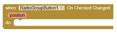
- Event to be invoked when the checked state of a Radio Button changed. Returns the position of the Radio Button into RadioGroup Button.
-
Procedures
- Create RadioGroup Button
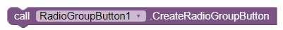
- This method allows us to create the Radiogroup Button. If you do not initialize it, the component will be a simply View without functionality.
- Clear Checks
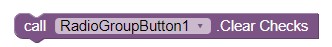
- Clears the selection. When the selection is cleared, the property 'Checked Button' and Event 'On Checked Changed' returns -1.
-
Properties
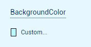
- Background Color
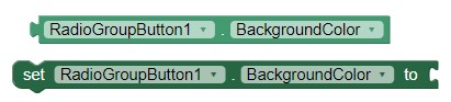
- With this property you can set the background color for RadioGroup Button component.
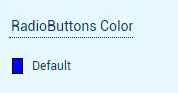
- Radio Buttons Color
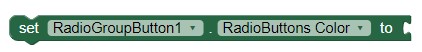
- With this property you can set the color of the Radio Buttons inside RadioGroup Button.
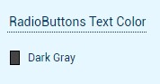
- Radio Buttons Text Color
-
- With this property you can set the color of the text of the Radio Buttons inside RadioGroup Button.
- Checked Button (Integer)
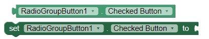
- With this property you can set or get the check button of the RadioGroup Button.
- Height
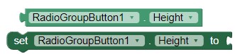
- Allows you to set the height of the RadioGroup Button.
- Height in percentage
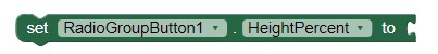
- Allows you to set the percentage height of the RadioGroup Button.
- Width
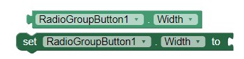
- Allows you to set the width of the RadioGroup Button.
- Width in percentage
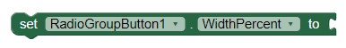
- It allows to set the width in percentage of the RadioGroup Button.
-
Example
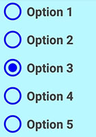
- Creating a RadioGroup Button
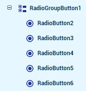
- To do this we will use the RadioGroup Button component and
Radio Buttons. We add in the DESIGNER the Component RadioGroup Button and drag in it,
the Radio Buttons that we want.
- We can configure it in the DESIGNER or BLOCKS section, for
example:
We changed the text content(Like option), background color of RadioGroup Button,
color for
Radio Buttons and the color of their texts.
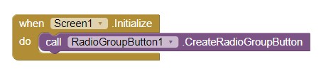
- In the BLOCKS section, we must initialize the component using the
method 'Create RadioGroup Button'.
- We compile and we already have our customized
RadioGroup Button.