
Components
keyboard_arrow_up
Add
Rating Bar
-
Description
Rating Bar
A RatingBar is a visible component that shows a rating in stars. The user can touch/drag to set the rating.

-
Events
- On Rating Changed
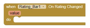
- Event that triggers when the rating changes. The parameter 'value' retuns the current rating.
-
Properties
- Background Color (Integer)
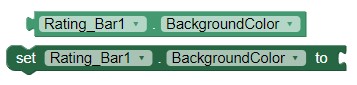
- With this property you can set the backgorund color of the Rating Bar.
- Height
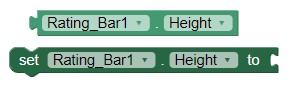
- Allows you to set the height of the Rating Bar.
- Height in percentage
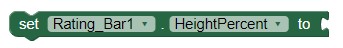
- Allows you to set the percentage height of the Rating Bar.
- Width
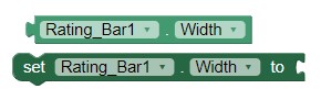
- Allows you to set the width of the Rating Bar.
- Width in percentage
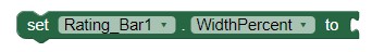
- It allows to set the width in percentage of the Rating Bar.
- Is indicator? (Boolean)
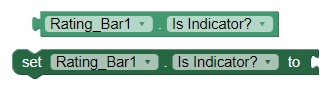
- Allows to set if Rating bar is an indicator (and non-changeable by the user).
- Number Of Stars (Integer)
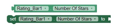
- Allows to set the number of stars (or rating items) to show. Default value is 5.
- Rating (Float)
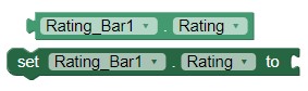
- Allows to set the rating to set by default. Default value is 4.5f.
- Star Color (Integer)
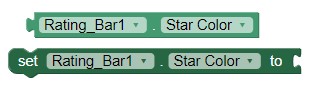
- Sets the Color of the stars in Rating Bar.
- Star Shadow Color (Integer)
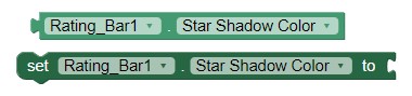
- Sets the color of shadow for the stars in Rating Bar.
- Star Shadow Color (Integer)
-
- Sets the Stars background color.
- Step Size (Float)
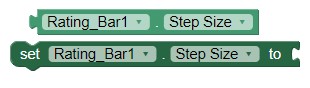
- Allows to set the step size of the rating. Default value is 0.5f.
- Visible (Boolean)
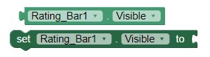
- Specifies whether the Rating Bar should be visible on the screen. The value is true if the component is displayed and false if it is hidden.
-
Example
- Creating a customizable Rating Bar
- It's easy, we only need to select colors and values from Rating
bar and set it in Event 'Initialize' from Screen like this:
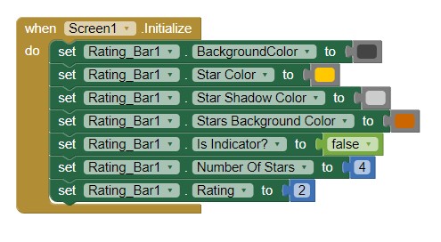
- We compile and we already have our customizable Rating
Bar!