
Sidebar
-
Description
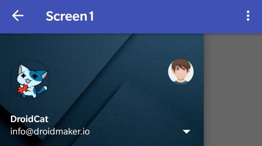
Sidebar - Closed
When you add this component to our application automatically add a button on the left side top that will allow us to open and close the side menu.

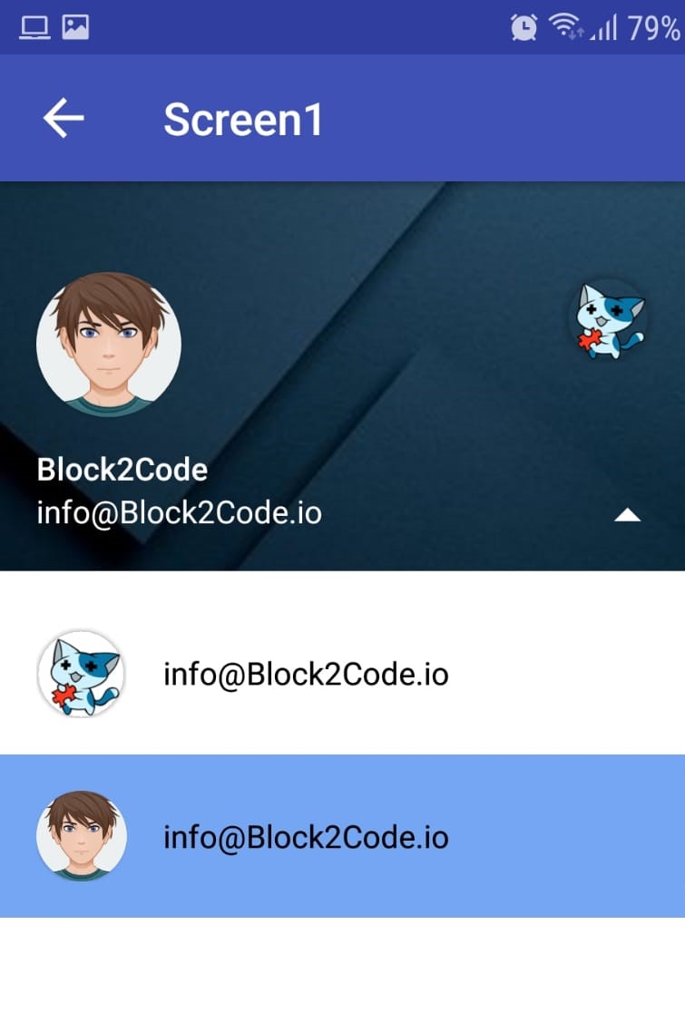
Sidebar - Open
When you open the side menu, you can see all the content of the same. To open it simply clicking the button in the top left or simply swipe your finger from the left edge of our mobile to the right. In addition when you open the menu, the icon in the upper left-hand corner will change, showing an arrow.
Sidebar - View Profiles
If you wish, you can add user accounts to your sidebar, so that each user that we record in the sidebar, you can have a profile picture, a name, and a e-mail. In addition, we will be able to add several users and change the account simply by clicking on the profile photo of the user that you want. You also have a menu in the which we will be able to view the data of each user, and change of profile; This is useful if you have a big number of profiles, as in the header, we can only display up to three different profiles.
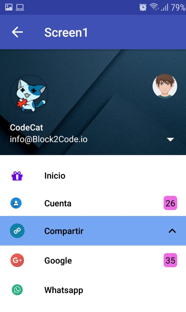
Sidebar - Expandable Item
The component that we offer has the ability to create Items that also contain sub Items or what we call the Expandable Item, is neither more nor less than a Item which will have a small arrow we can press to show or hide the sub Items.
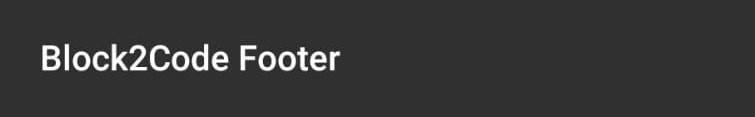
Footer
The component that we offer has the ability to create a footer for our sidebar menu.
-
Events
- On Drawer Opened
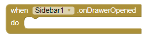
- Event that runs after the user opens the side menu.
- On Drawer Closed
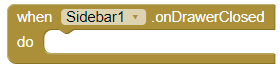
- Event that runs after the user closes the side menu.
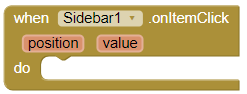
- On Menu Item Click
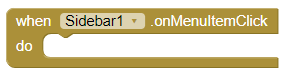
- Event that runs after the user click the button the menu side, that appears the upper left.
- On Profile Changed
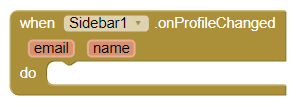
- Event that runs after the user's change of profile.
- On Item Click
- Event that runs after the user has clicked on a Item from the side menu.
-
Procedures
- Start Drawer
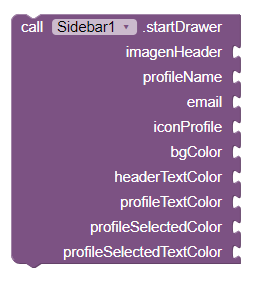
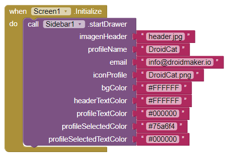
- This method starts the side menu, the parameters required are:
- - Image: For the header, we will need to upload the image and put in text the name of the image. Example: "header.png"
- - Profile name: This will be in text format. Example: "Block2Code"
- - Email: This will be in text format. Example: "info@block2code.com"
- - Profile image: As in the image for the header, we must upload the image and put in text the name of the image. Example: "Profile.png"
- - Background Color: For the side menu. In text format and hexadecimal. Example: "#FFFFFF"
- - Header Text Color: For the header, that is to say, the colors that will have the e-mail and the name of the user. Using text format and hexadecimal. Example: "#FFFFFF"
- - Profile Text Color: To the menu of profiles. The format will be the same indicated in the two previous examples. Example: "#000000"
- - Profile Selected Color: When you select a profile in the profile menu. The format will be the same as in the previous examples. Example: "#474256"
- - Profile Selected Text Color: When you select a profile in the profile menu. The format will be text and hexadecimal. Example: "#000000"
- Add Primary Item To Drawer
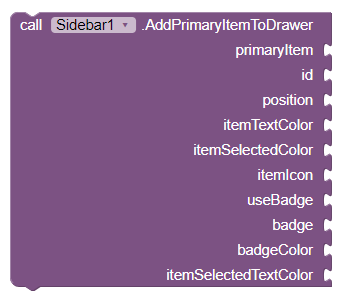
- This method allows the user to add an Item to the side menu, the
difference between the Primary Item and the Secondary Item is that, the first
it is a bit bigger so that it stands out a little more, while the secondary is more
small.
The parameters required by this method are:
- - Name: For Item in text format. Example: "Item Main"
- - Id: In numeric format, it is important that each Element has an id unique and have not Items with the same id.
- - Position: In numeric format, that will be in the position where it will be added the Item. It is important to note that the position 0 does not exist, the minimum position is 1.
- - Item Text Color: For the Item, the format will be text and hexadecimal. Example: "#000000"
- - Item Selected Color: To when the Item is selected. This will go on text format and hexadecimal. Example: "#474256"
- - Icon: For the Item. You will have to upload the image and put it through text the name of the image. No need to worry about the size, since it is transformed to an icon automatically. Example: "icono.png"
- - Use Badge: To indicate if we want to have a badge(icon with number of notifications). The format must be of type boolean.
- - Badge: it must be in text format. In the case of do not use badge, you can enter a text empty, but never leave without a parameter to the badge. Example: "56"
- - Badge Color: For the badge in text format and hexadecimal. In case not to use badge, you can enter a text empty, but never leave without a parameter the color of background of the badge. Example: "#d863e2"
- - Item Selected Text Color: To when the Item is selected. Format text and hexadecimal. Example: "#000000"
- Add Secondary Item To Drawer
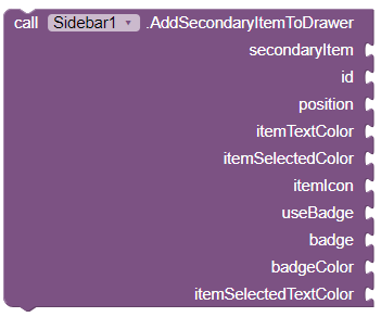
- This method allows the user to add a Secondary Item to the side menu. The
difference between the Primary Item and the Secondary Item, is that the fisrt
it is a bit bigger so that it stands out a little more, while the secondary is more
small.
The parameters required by this method are:
- - Name: For Item in text format. Example: "Item Main"
- - Id: In numeric format, it is important that each Element has an id unique and have not Items with the same id.
- - Position: In numeric format, that will be in the position where it will be added the Item. It is important to note that the position 0 does not exist, the minimum position is 1.
- - Item Text Color: For the Item, the format will be text and hexadecimal. Example: "#000000"
- - Item Selected Color: To when the Item is selected. This will go on text format and hexadecimal. Example: "#474256"
- - Icon: For the Item. You will have to upload the image and put it through text the name of the image. No need to worry about the size, since it is transformed to an icon automatically. Example: "icono.png"
- - Use Badge: To indicate if we want to have a badge(icon with number of notifications). The format must be of type boolean.
- - Badge: it must be in text format. In the case of do not use badge, you can enter a text empty, but never leave without a parameter to the badge. Example: "56"
- - Badge Color: For the badge in text format and hexadecimal. In case not to use badge, you can enter a text empty, but never leave without a parameter the color of background of the badge. Example: "#d863e2"
- - Item Selected Text Color: To when the Item is selected. Format text and hexadecimal. Example: "#000000"
- Add Expandable Item
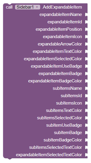
- This method allows the user to add an Expandable Item to the side menu.
With
this type of element you can add sub-items that may be shown or
hide by clicking on the arrow in the drop-down. The parameters required by this
method are:
- - Name: For the Expandable Item in text format. Example: "Element Expandable"
- - Id: In numeric format. It is important that each Expandable Item has a unique id and do not have Elements with the same id.
- - Position: In numeric format. This will be the position where to insert the Expandable Item . It is important to note that the position 0 does not exist, the position minimum is the 1.
- - Icon: For the Expandable Item, we need to upload the image and put using text the name of the image, no need to worry about the size, since it is transformed to icon automatically. Example: "icono.png"
- - Arrow Color: For the arrow on the Expandable Item, the format will be text and hex. Example: "#000000"
- - Expandable Item Text Color: For the Expandable Item, the format will be text and hex. Example: "#000000"
- - Expandable Item Selected Color: To when the Expandable Item is selected. In text format and hex. Example: "#474256"
- - Use Badge: To indicate if we want to have a badge(icon with number of notifications). The format must be of type boolean.
- - Badge: it must be in text format. In the case of do not use badge, you can enter a text empty, but never leave without a parameter to the badge. Example: "56"
- - Badge Color: For the badge in text format and hexadecimal. In case not to use badge, you can enter a text empty, but never leave without a parameter the color of background of the badge. Example: "#d863e2"
- - SubItems Name: A list with the names for the SubItems that we want to add to the Expandable Item in text format. Example: "SubElemento1 "
- - SubItems Id: A list with the ids in numerical format. It is important that each Sub-Items has an id unique and does not have Sub-Items with the same id, you should also take into account the order, that is to say, the first id in the list will be the one that corresponds to the first Sub-Item of the list of names.
- - SubItems Text Color : A list with the colors of the text for each Sub-Item of the list, the format will be text and hexadecimal. Example: "#000000"
- - SubItems Selected Color: A list with background colors for when the SubItem is selected. Format text and hex. Example: "#474256"
- - SubItems Use Badge:a list with booleans to indicate if we want to have badge(icon with number of notifications). The format must be of type boolean.
- - SubItems Badge: A list with the numbers of badge notifications in text format. In case of not use badge you can enter a text empty, but never leave without a parameter to the badge. Example: "56"
- - SubItems Badge Color: A list with background colors for the badge. In text format, and hex. In case not to use badge, you can enter a blank text, but never leave without parameter to the badge. Example: "#d863e2"
- - SubItems Selected Text Color:A list with the text color when the SubItem is selected. Format text and hex. Example: "#000000"
- - Expandable Item Selected Text Color: To when the Expandable Item is selected. In text format and hexadecimal. Example: "#000000"
- Add Sticky Footer
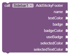
- This method allows the user to add a Footer to the side menu.
With this
method we will be able to add a footer to our side menu,
the footer will be clickable, so that it is not only decorative, you may also be
give a
function. The parameters required by this method are:
- - Name: For the footer, in text format. Example: "Footer"
- - Text Color:For the footer, the format will be text and hex. Example: "#000000"
- - Badge: it must be in text format. In the case of do not use badge, you can enter a text empty, but never leave without a parameter to the badge. Example: "56"
- - Badge Color: For the badge in text format and hexadecimal. In case not to use badge, you can enter a text empty, but never leave without a parameter the color of background of the badge. Example: "#d863e2"
- - Use Badge: To indicate if we want to have a badge(icon with number of notifications). The format must be of type boolean.
- - Selected Color: For when the footer is selected. Format text and hexadecimal. Example: "#474256"
- - Selected Text Color: For when the footer is selected in format text and hexadecimal. Example: "#000000"
- Add User
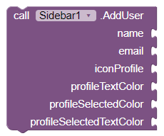
- This method allows us to add a user to the header of the side menu,
in addition
you can add as many users as you want,
but in the header will only be 3. The rest can be seen on the users menu. The
parameters that
requires this method are:
- - Name: Name for the user in text format. Example: "User1"
- - Email: This will be in text format. Example: "info@block2code.com"
- - Icon Profile: Image for the user profile, as in the image for the header, we will have to raise the image and put in text the name of the image. Example: "Perfil.png"
- - Profile Text Color: Color for the text in the menu of profiles, the format will be text and hex. Example: "#000000"
- - Profile Selected Color: Background Color when you select a profile in the profile menu. The format will be the same as in the previous examples. Example: "#474256"
- - Profile Selected Text Color: Color for the text when you select a profile in the profile menu. The format will be text and hexadecimal. Example: "#000000"
- Delete User
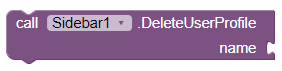
- This method allows us to remove a user from the header side menu. The
parameters required by this method are:
- - Name: For the profile that you want to delete in text format. Example: "User1"
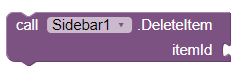
- Delete Item
- Este método, nos permite eliminar un elemento del menú lateral. Los
parámetros que
requiere este método son:
- - Id: The id of the Item that we wish to delete, in numeric format.
- Update Item Name
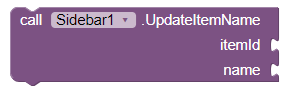
- This method allows us to update the name of a side menu item. The
parameters required by this method are:
- - Id: The id of the item we want to update, in numeric format.
- - Name: The new name that we want to put the item, in the format of text. Example: "New Name".
- Update Badge
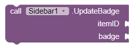
- This method allows us to update the badge of a side menu item
. The parameters required by this method are:
- - Id: The id of the item we want to update, in numeric format.
- - Badge: The new badge value for the item. The format is text. Example: "28".
- Update Item Icon
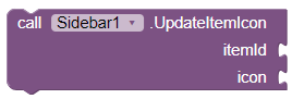
- This method allows us to update the icon of a side menu item . The
parameters required by this method are:
- - Id: The id of the item we want to update, in numeric format.
- - Icon: The new Icon for the item, remember that we will need to upload the image and put by text the name of the image. Example: "newIcon.png".
- Set Selected Item
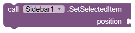
- This method allows us to select programmatically an item of
the side menu. The parameters required by this method are:
- - Position: The position of the Item(in numeric form), that we wish to establish as selected.
- Show
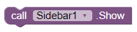
- This method allows us to show the side menu.
- Hide
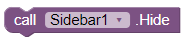
- With this method, we hide the side menu.
- ¿Is Drawer Opened?
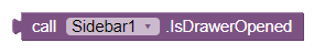
- This method, we return a boolean that will tell us if the side menu this open or not. If the menu is open returns true, otherwise, it returns false.
Example
- Start the Side Menu
- Add Primary Item
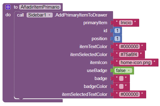
- When we put the icon, we must remember that we put the name of the image, as the field is of type text, we must also remember that each Item must have a unique id.
- Add Secondary Item
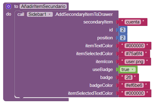
- When we put the icon, we must remember that we put the name of the image, as the field is of type text, we must also remember that each Item must have a unique id.
- Add Expandable Item
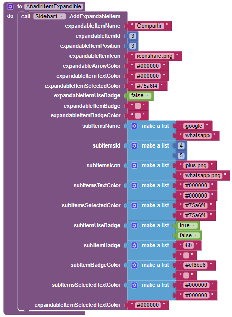
- When we put the icon, we must remember that we put the name of the image, as the field is of type text, we must also remember that each Item must have a unique id, so the Expandable Item as the SubItems.
Download Files
- We leave you here an AIA example, so that you can understand and see as it works in the sidebar.
- Sidebar.aia
- Remember, if you have any doubts, you can come over to the forum and ask any questions you have what you need Block2Code Community.