Components
keyboard_arrow_up
Add
Wave Loader
Description
Wave Loader
The Wave Loader component allows you to add an animation indicating the progress. This component has many customization options.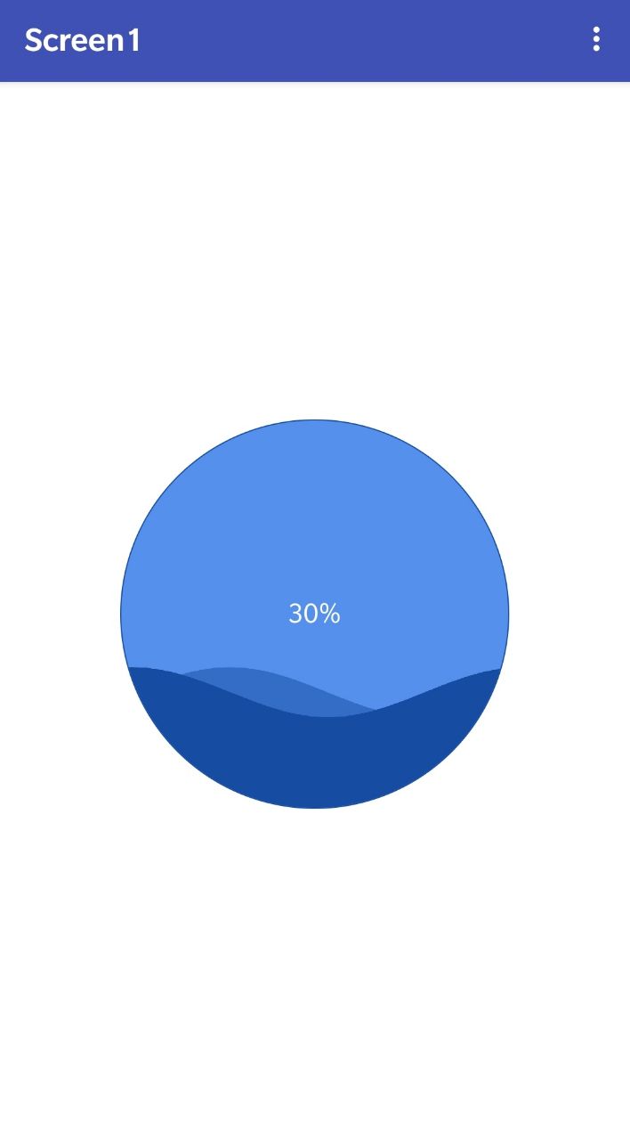
Result
Procedures
- Start Loader
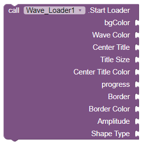
- This method will allow us to start the loader by receiving a series of configuration parameters that will be explained below
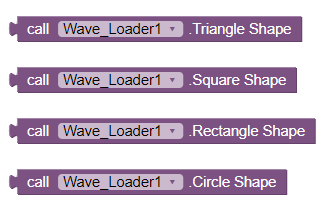
- Shape Types
-
There are 4 types of shape as you can see in the image
- - Triangle
- - Square
- - Rectangle
- - Circle
- Set Wave Color

- This will allow us to indicate the color of the progress wave.
- Get Progress

- This method will return the current progress of the Loader.
- Set Progress

- This method will allow us to establish the current progress of the Loader.
- Set Text

- This method will allow us to establish the text of the Loader, normally it is used to show the percentage of progress.
- Set Text Color

- This method will allow us to set the text color of the Loader.
- Set Background Wave Color

- This method will allow us to set the background color of the Loader.
Properties
- Height
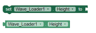
- It allows us to establish and obtain the height of the Wave Loader.
- Height Percent

- It allows us to set the percentage height of the Wave Loader.
- Widht
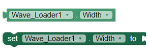
- It allows us to establish and obtain the width of the Wave Loader .
- Width Percent

- It allows us to set the percentage width of the Wave Loader.
- Visible
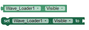
- Specifies whether the Wave Loader should be visible on the screen. The value is true if the component is displayed and false if it is hidden.
Example
- Start Wave Loader
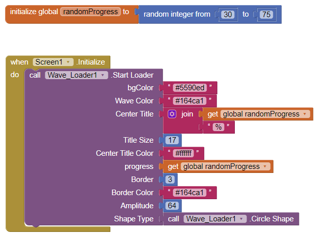
- It is important not to leave any field empty, otherwise it will not work.
Download Files
- Here is an example AIA so you can better understand how this component works
- WaveLoader.aia
- Remember, if you have any questions you can always use our forum to ask everything you need Community Block2Code.