
Components
keyboard_arrow_up
Add
Contact picker
-
Description
- ContactName: contact's name.
- EmailAddress: contact's primary email address.
- Picture: name of the file containing the contact's image, which can be used as a Picture property value for the Image or ImageSprite component.
Contact picker
The Contact picker component to let the user choose an entry from the Android contact list. A contact picker is a contactPicker that displays a list of contacts to choose from when the user taps it. After the user has made a selection, the following properties are set:
-
Events
- After picking
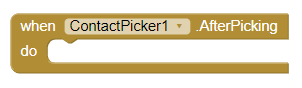
- This event called after user picks a contact.
- Before Picking
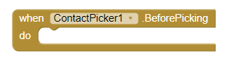
- This event called after user taps contact picker but before contact list is displayed.
- Got Focus
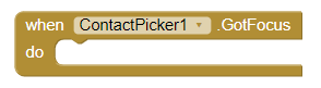
- Contact picker became the focused Contact picker.
- Lost Focus
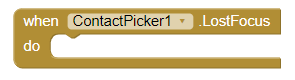
- Contact picker stopped being the focused Contact picker.
- Touch down
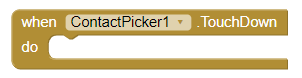
- This event is activated, when we press the Contact Picker down.
- Touch up
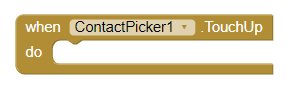
- This event is activated, when we stop pressing the Contact Picker.
-
Procedures
- Open

- This method opens the picker, as though the user clicked on it.
- View contact
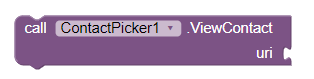
- Views a contact given its URI or path on phone.
-
Properties
- Background color
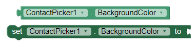
- Set the background color of the Contact Picker.
- Enabled
- If set, user can tap contact picker to use it.
- Font bold
- If set, contact picker text is displayed in bold.
- Font italic
- If set, contact picker text is displayed in italics.
- Font size
- Point size for contact picker text.
- Height
- Contact picker height (y-size).
- Height in percentage
- Set the height in percentage.
- Width
- Contact picker width (x-size).
- Width in percentage
- Set the width in percentage.
- Image
- Specifies the path of the button's image. If there is both an Image and a BackgroundColor, only the Image will be visible.
- Show feedback

- Specifies if a visual feedback should be shown for a button that as an image as background.
- Text
- Text to display on contact picker.
- Text color
- Color for contact picker text.
- Visible
- Set the visibility of the contactPicker. It can be "Visible", so that the contactPicker or "Hidden" can be seen to hide it.
- Contact name
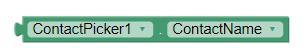
- The contact's name.
- Contact Uri
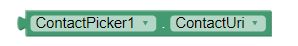
- The path to the contact on the phone.
- Email Address
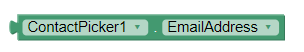
- The contact's primary email address.
- Email Address list
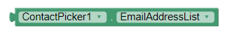
- A list of the contact's email addresses.
- Phone number
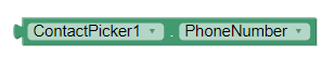
- The contact's primary phone number.
- Phone number list
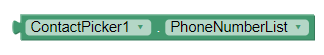
- A list of the contact's phone numbers.
- Picture
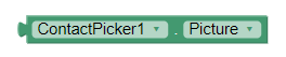
- The name of the file containing the contact's image, which can be used as a Picture property value for the Image or ImageSprite component.