Components
keyboard_arrow_up
Add
Dialog
-
Description
Dialog
A dialog is a text that is displayed to the user usually to show a simple message. With this component we can generate Different dialogues with style Material Desing.
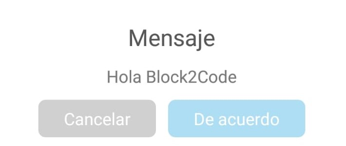
Informative

With icons
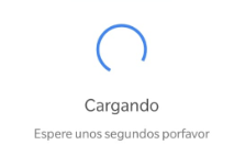
With progress bar
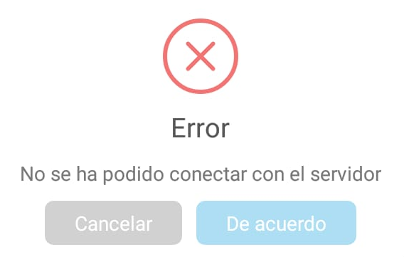
Error messages
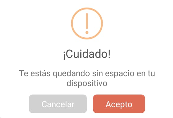
Alert messages
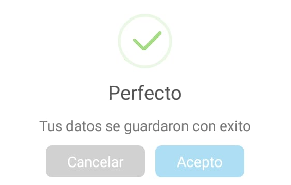
Success messages
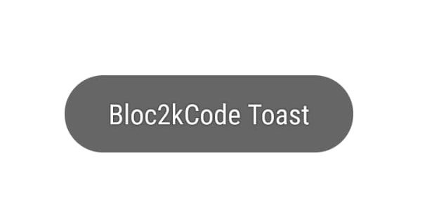
Toast
-
Events
- On message dialog canceled

- Event that is executed when the cancel button is pressed in a dialog of the type message.
- On message dialog confirmed

- Event that is executed when the confirm button is pressed in a dialog of the message type.
- On message dialog with custom icon canceled

- Event that is executed when the cancel button is pressed in a dialog with icon.
- On message dialog with custom icon confirmed

- Event that is executed when the confirm button is pressed in a dialog with icon.ç
- On progress dialog canceled

- Event that is executed when the cancel button is pressed in a dialog with progress bar.
- On error message canceled

- Event that is executed if there was an error when pressing cancel in the error type dialog.
- On error message confirmed

- Event that is executed if there was an error when pressing confirm in the error type dialog.
- On success message canceled

- Event that is executed when the cancel button is pressed in a dialog of the type success.
- On success message confirmed

- Event that is executed when the confirm button is pressed in a dialog of the success type.
- On warning message canceled

- Event that is executed when the cancel button is pressed in a dialog of the alert type.
- On warning message confirmed

- Event that is executed when the confirm button is pressed in a dialog of the alert type.
-
Procedures
- Show message dialog
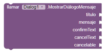
- This method opens an informative dialogue, which we can configure.
- Show error message dialog
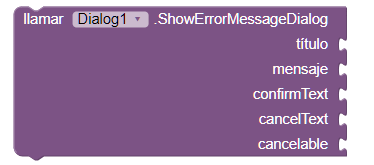
- This method opens an error dialog, which we can configure.
- Show success message dialog
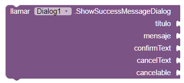
- This method opens a success dialogue, which we can configure.
- Show dialog message warning
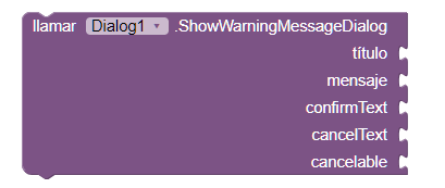
- This method opens an alert dialog, which we can configure.
- Show dialog message with icon
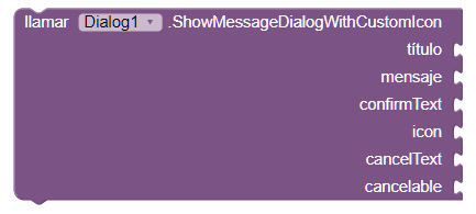
- This method opens a dialog with an icon, which we can configure. When we put the icon, we must remember to put the name of the image, since the field is text type.
- Show progress dialog
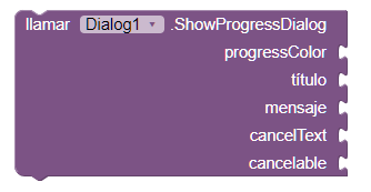
- This method opens a dialogue with progress bar, which we can set up.
- Dismiss progress dialog

- This method cancels the progress bar of our dialog.
- Is spinning progress dialog

- This method allows us to know if the progress bar is active or not. Returns a boolean value.
- Show toast

- This method shows a toast, which we can configure. The values for the duration are: 0 short length, 1 long length.
-
Example
- Error dialog

- Dialog with icon
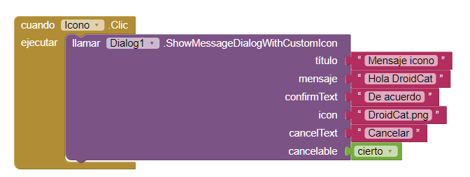
- When we put the icon, we must remember to put the name of the image, since the field is text type.