Components
keyboard_arrow_up
Add
Notifier
-
Description
- - Message dialog: Shows a message that the user must discard pressing a button.
- - Choice dialogue: Shows a two-button message to allow to the user choose one of the two answers, for example, yes or no, after which generates the 'After choosing' event.
- - Text dialog: Allows the user to enter text in response to message,after which the event 'After text input' is generated.
- - Warning dialog Shows a temporary alert that disappears after a short time.
- - Linear progress dialog: Shows an alert with a spinner load that the user can not rule it out It can only be discarded by using the block 'Dismiss progress dialog'.
- -Dismiss progress dialog: Discards the progress dialog shown by 'Progress dialog'.
- - Error log: Log an error message in the Android registry.
- - Registration of warnings: records a warning message in the register of Android.
Notifier
The Notifier component displays dialog boxes for alerts, messages and temporary alerts. It is the predecessor of the component dialog and create Android registry entries to through the following methods:
The messages in the dialog boxes (but not in the alert) can format using the following labels HTML:<b>, <big>, <blockquote>, <br>, <cite>, <dfn>, <div>, <em >, <small>, <strong>, <sub>, <sup>, <tt>
. -
Events
- After message selection

- Event that is executed when the user has selected an option in a message type dialog. If canceled, -1 is returned.
- After Checkboc selection

- This event is activated after the user has finished select the options of the boxes check. This event returns a list of the selected indexes. If he user cancels the dialog, returns -1.
- Affer radio selection

- Event that is executed when the user has selected an option in a group of buttons. If canceled, -1 is returned.
- After enter text

- This event is activated after the user has responded in text field.
- After message selection

- This event is activated after the user has selected a text in a complex text dialogue. Returning the selected value.
- After complex message selection

- This event is activated after the user has selected a text in a complex text dialogue. Returning the selected value.
- After image closed

- Event that is executed when an image is closed in the dialog.
- After list pick
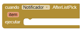
- Event that is executed when the user has chosen an option in the list of the dialog with list selector.
-
Procedures
- Checkbox list picker
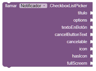
- This method creates a dialogue with a selector, which allows us to add a list of options to choose. You can choose several options simultaneously.
- RadioList picker
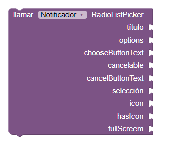
- This method creates a dialogue with a selector, which allows us to add a list of options to choose. You can choose only one option.
- Show choose dialog
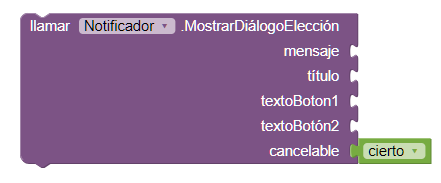
- This method generates a dialog that contains two buttons, to which we can configure the text. If we activate the option 'cancelable' another button will appear with the cancel text, which will allow us to close our dialogue.
- Show linear progress
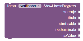
- Displays a dialog box with an optional title and message (use empty strings if they are not wanted). This dialog box contains a rotating artifact to indicate that the program is working. It can not be canceled by the user, but must be discarded by the App program Inventor using the block 'dismiss progress dialog'.
- Update progress

- This method allows you to update the progress bar. It will not work if it has the option 'indeterminate' activated.
- Dismiss progress dialog

- This method cancels the progress bar of our dialog.
- Show list picker
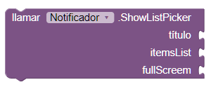
- This method creates a dialog that contains a list, the user can select the elements.
- Show message dialog
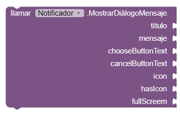
- This method creates a text dialog.
- Show complex message dialog
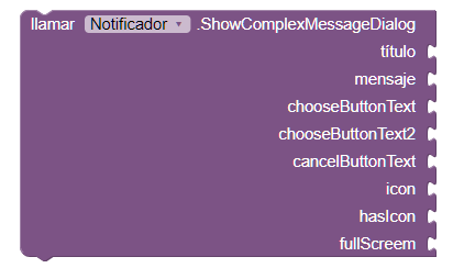
- This method creates a complex text dialogue, with title, message, buttons, icons and with the possibility of maximizing it ...
- Show complex message dialog

- This method creates a rotating progress dialog. If we activate the cancelable option the user can cancel it.
- Show text input dialog
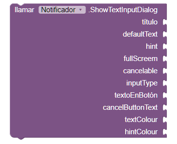
- This method creates a dialog with a text field. You can choose the type field, for example for a password. It also allows to define the insinuating text.
- Show toastt

- This method shows a toast, to which we can add the text that we want.
-
Procedures
- Set theme

- This method allows you to modify the current theme.