Components
keyboard_arrow_up
Add
Date picker
-
Description
Date picker
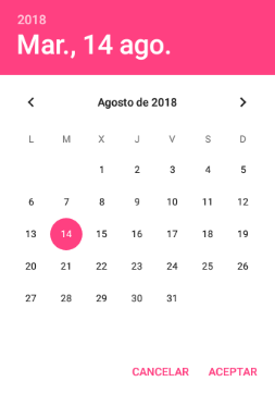
The date picker is a button that, when clicked on, it, opens a pop-up dialog box to allow the user to select a date. We can configure the visual aspect of the button as well as the events associated with the date selector.

-
Events
- After date set

- Event that is executed after the user chooses a date in the dialogue.
- Got focus

- Event that is executed after the cursor moves over the button, so it is now possible to click on it.
- Lost focus

- Event that is executed after the cursor moves away from the button, so that it is no longer possible to click on it.
- Touch down

- Event that is executed after the button was pressed towards down.
- Touch up

- Event that is executed after the button has been released.
-
Procedures
- Launch Picker

- This method starts the popup window of the Date picker.
- Set Date To Display (number year, number month, number day)

- This method allows the user to set the date that will be displayed when the date selector opens. Valid values for the month field are 1-12 and 1-31 for the day field.
- Set Date To Display From Instant (Instant In Time instant)

- This method allows the instant to configure the year, month and day that is will show when the date selector opens. The instants are used in the components Clock, Date Picker and Time Selector.
-
Properties
- Background color

- It allows to put a color for the background of the button.
- Bold font

- If set, the text of the button is shown in bold.
- Italic font

- If it is set, the text of the button is shown in italics.
- Font size

- If set, change the size of the button text.
- Enabled

- Determines whether the component is ('True') or not ('False') enabled.
- Height

- To establish the height.
- Height in percentage

- To set the height as a percentage.
- Width

- To set the width.
- Width in percentage

- To set the width in percentage.
- Image

- To set an image on the button.
- Show feedback

- It establishes a visual effect to know that the button has been pressed.
- Text

- To set a text on the button.
- Visible

- Specifies whether the component should be visible on the screen. The value is true if the component is displayed and false if it is hidden.
- Day, month and year

- We can obtain the day, month and year using these variables from the date picker, here they are added as text to the button that opens the date selector, when initializing the screen.