
Components
keyboard_arrow_up
Add
View Tooltip
-
Description
View Tooltip
The View Tooltip is a component that creates a graphical user interface (GUI) element to display information about the item/component asociated.
You can use the tooltip view component for example by clicking on another item to show information about this.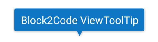
-
Events
- On display
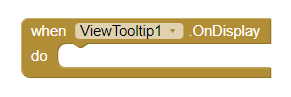
- Event that is executed when View Tooltip shows.
- On hide
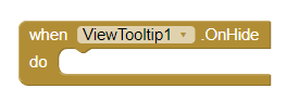
- Event that is executed when View Tooltip hidden.
-
Procedures
- Show View Tooltip
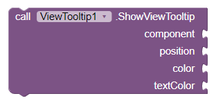
- This method creates and showing the ViewTooltip.
- Component: The View Tooltip will be displayed near this component (View).
- Position: Where the View Tooltip will be positioned respect to the chosen component. Options: BOTTOM| TOP| RIGHT| LEFT.
- Color: Background color for View Tooltip. Format HTML.
- Text color: Color for View Tooltip text. Format HTML.
- Positions for View Tooltip
-
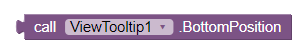
BOTTOM:
-
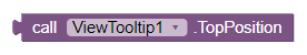
TOP:
-
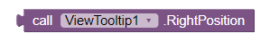
RIGHT:
-
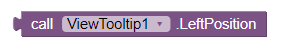
LEFT:
Properties
- Arrow Height (integer)
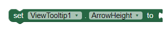
- To establish the height for arrow View Tooltip.
- Arrow Width (integer)
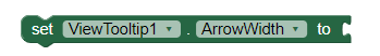
- To establish the width for arrow View Tooltip.
- Auto hide (boolean)
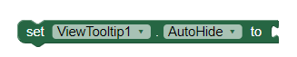
- If it is set, the View Tooltip auto hides.
- Click to hide (boolean)
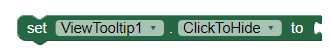
- If set, View Tooltip hides when user click on it.
- Corner radius (integer)
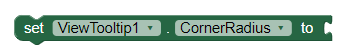
- To establish the radius from corners of View Tooltip.
- Distance with view (integer)
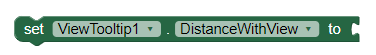
- To establish the distance between View Tooltip and chosen component.
- Duration (integer)
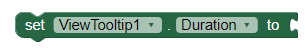
- To set the duration of time in which the View Tooltip will be displayed.
- Text (string)
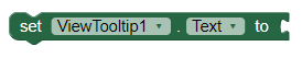
- To set the text will be displayed in View Tooltip.