
Phone number picker
-
Description
- ContactName: contact's name.
- PhoneNumber: the contact's phone number.
- EmailAddress: the contact's email address.
- Picture: the name of the file containing the contact's image, which can be used as a Picture property value for the Image or ImageSprite component.
Phone Number Picker
The component Phone Number Picker is a button that, when clicked on, displays a list of the contacts phone numbers to choose among.
After the user has made a selection, the following properties will be set to information about the chosen contact:Other properties affect the appearance of the button (TextAlignment, BackgroundColor, etc.) and whether it can be clicked on (Enabled).
The Phone Number Picker component may not work on all Android devices. For example, on Android systems before system 3.0, the returned lists of phone numbers and email addresses will be empty. -
Events
- After picking
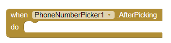
- Simple event to be raised after the picker activity returns its result and the properties have been filled in.
- Before Picking
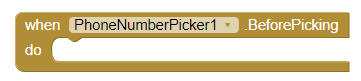
- Simple event to raise when the component is clicked but before the picker activity is started.
- Got Focus
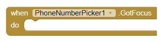
- Indicates the cursor moved over the button so it is now possible to click it.
- Lost Focus
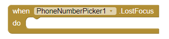
- Indicates the cursor moved away from the button so it is now no longer possible to click it.
- Touch down
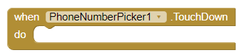
- This event is activated, when we press the Phone number picker down.
- Touch up
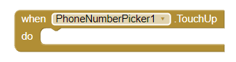
- This event is activated, when we stop pressing the Phone number picker.
-
Procedures
- Open
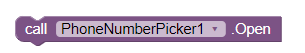
- This method opens the picker, as though the user clicked on it.
- View contact
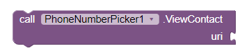
- Views a contact given its URI or path on phone.
-
Properties
- Background color
- Set the background color of the Phone number picker.
- Enabled
- If set, user can tap Phone number picker to use it.
- Font bold
- If set, Phone number picker text is displayed in bold.
- Font italic
- If set, Phone number picker text is displayed in italics.
- Font size
- Point size for Phone number picker text.
- Height
- Phone number picker height (y-size).
- Height in percentage
- Set the height in percentage.
- Width
- Phone number picker width (x-size).
- Width in percentage

- Set the width in percentage.
- Image
- Specifies the path of the button's image. If there is both an Image and a BackgroundColor, only the Image will be visible.
- Show feedback

- Specifies if a visual feedback should be shown for a button that as an image as background.
- Text
- Text to display on Phone number picker.
- Text color
- Color for Phone number picker text.
- Visible
- Set the visibility of the Phone number picker. It can be "Visible", so that the Phone number picker or "Hidden" can be seen to hide it.
- Contact name
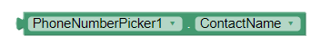
- The contact's name.
- Contact Uri
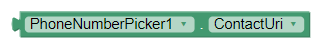
- The path to the contact on the phone.
- Email Address
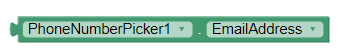
- The contact's primary email address.
- Email Address list
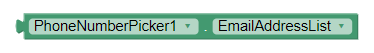
- A list of the contact's email addresses.
- Phone number
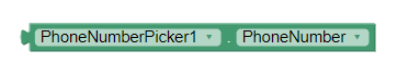
- The contact's primary phone number.
- Phone number list
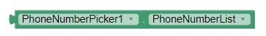
- A list of the contact's phone numbers.
- Picture
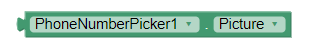
- The name of the file containing the contact's image, which can be used as a Picture property value for the Image or ImageSprite component.