Vertical Scroll Arrangement
-
Description
- If the property 'Width' of a vertical arrangement is set to Automatic, the actual width of the provision is determined by the component width in the available whose Width property is not configured as 'Adapt to'father'. the
- If the property 'Width' of a vertical arrangement is set to Automatic and it contains only components whose Width properties are set to 'Adapt to'father', the actual width of the provision is calculated using the widths of automatic components. the
- If the property 'Width' is set to Automatic and it is empty, the width will be 100. the
- If the property 'Heigh' is set to Automatic, the actual height of the arrangement it is determined by the sum of the heights of the components. the
- If the property 'Heigh' is set to Automatic, any components whose properties height to be set as 'Adapt to'father' they will behave as if they were set to Automatic. the
- If a property 'Heigh' is configured as 'Adapt to' father ' or is specified in pixels, any component whose properties height are set to 'Adapt to the' father ' will also occupy a great height not occupied by other components.
Vertical Scroll Arrangement
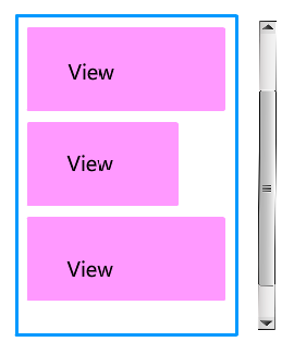
The component Vertical Scroll Arrangement allows us to organize other components in vertical. That is to say visually the components are added one below the other in our screen. This component is an element of the format in which it places the components that are should be displayed one below the other. If you want the components to display one side by side, use Horizontal Layout in its place. Unlike the vertical arrangement, this component is scrollable so that the property vertical alignment will not have any effect.
-
the

-
Properties
- Horizontal Alignment

- Is given by a number that encodes how contents of the
provision is aligned horizontally. The options are:
- 1: Left-aligned.
- 2: Aligned to the right.
- 3: Horizontally centered.
- Vertical Alignment

- Is given by a number that encodes how contents of the
available are lined up vertically. The options are:
- 1: Aligned at the top.
- 2: Aligned at the bottom.
- 3: Centered vertically.
- Background Color

- Allows you to put a color for the background, to the vertical arrangement Enrrollable.
- Heigh

- To set the height to the vertical arrangement.
- Height in percentage

- To set the height in percentage to the vertical arrangement Enrrollable.
- Width

- To set the width to the Vertical Scroll Arrangement.
- Width in percentage

- To set the width in percentage of the available vertical Enrrollable.
- Image

- To set the image to the vertical arrangement Enrrollable. If there is an image and a background color, you only see the image.
- Visible

- Specifies whether the component should be visible, as well as its content in the screen. The value is true if the component is showing and false if it is hidden.
-
Example
- Vertical Scroll Arrangement
- This example what we can do without using any type of block, though could be done using the blocks of properties. To do this we have created the following distribution.
-

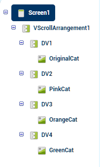
On the screen we have added a vertical arrangement Enrrollable that will be the one that organize the components of our screen. Within this we have added 4 provisions in vertical, so-called 'DV1', 'DV2', 'DV3' and 'DV4', and within each of them an image.-

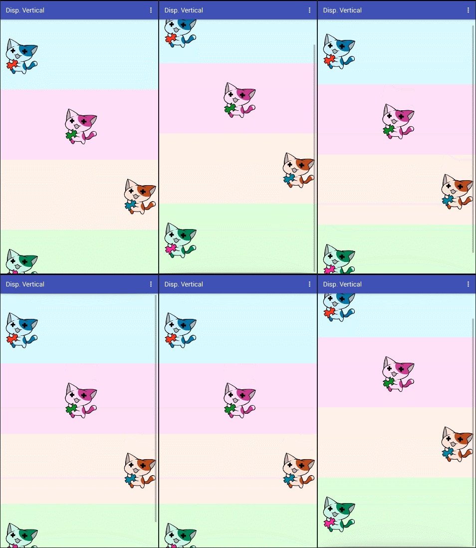
- As you can see, now the components do not fit on the screen,
but if you move it from top to bottom this moves allowing us to see the content.
-
the
- 'DV1' the color blue, we've set the property 'Alignment Horizontal' to 1 or left, so the image is located on the left side. the
- 'DV2' the color pink, we've set the property 'Alignment Horizontal' to 2 or center, so the image is located in the center. the
- 'DV3' the color orange, we have set the property 'Alignment Horizontal' to 3 or right, that's why the image is located on the right side. the
- 'DV4' the color green, we've set the property 'Alignment Horizontal' 1 or left, so the image is located on the left side.