
TextBox
-
Description
TextBox
Users enter a text in a field component of text. The value of the initial text or entered by the user into a text field component is found in the property text.
If the text is blank, you can use the 'Hint' property to provide the user a suggestion on what to write. The text 'Hint' appears with a weaker color intensity than normal text in the field.
The 'Multi-line' property determines whether the text can have more than one line. For a single-line text field, the keyboard will close automatically when the user press the 'Done' key. To close the keyboard in the text fields of multiple lines, the application must use the 'Hide keyboard' method or depend on the user to press the Back key.
The 'Numbers Only' property restricts the keyboard to accept only numeric entries. Other properties affect the appearance of the text field (Alignment of text, background color, etc.).
Text fields are generally used with the Button component, and the user does Click on the button when the text entry is completed. If the text entered by the user should not be displayed, you can use the component 'Password text field' instead. -
Events
- Got focus
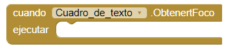
- This event is executed when the cursor is over the field of text.
- Lost focus

- This event is executed when the cursor is no longer on the text field.
-
Procedures
- Request focus
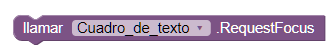
- This method allows us to focus the field. In the same way that if the user to do it when passing the cursor over the field.
- Hide keyboard
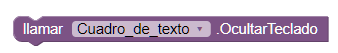
- This method allows us to hide the keyboard.
-
Properties
- Background color

- Sets the background color of the text field.
- Enabled
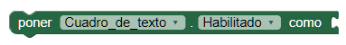
- It allows to establish if the text field is enabled or not.
- Font size
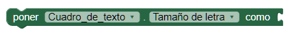
- If set, change the text size of the text field.
- Height
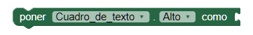
- It allows us to set the height of the text field.
- Height in percentage
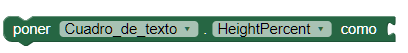
- It allows us to set the percentage height of the text field.
- Width
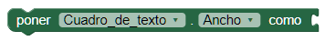
- It allows us to set the width of the text field.
- Width in percentage
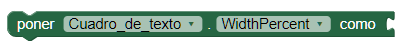
- It allows us to set the width in percentage of the text field.
- Set hint
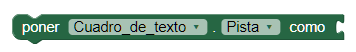
- If is set, a text will appear in the form of a track on the field of text, guiding the user what type of content should be entered.
- Multi-line
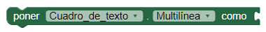
- If set to true, the user can write more than one line. When using Multi-line, we must invoke the 'Hide keyboard' procedure since it is only done automatically when the text box supports a single line.
- Only numbers
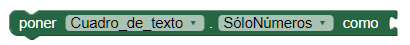
- If set to true, the user can only write numbers in the Text's box.
- Text
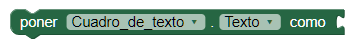
- It serves to put text in the text field.
- Text color
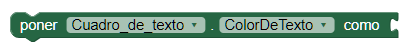
- It is used to put color in the text of the text field.
- Visible
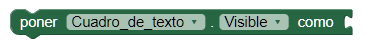
- Specifies whether the text field should be visible on the screen. The value is true if the component is displayed and false if it is hidden.