
Spinner
-
Description
Spinner
The component Spinner allows you to display a pop-up window with a list of items. These elements can be set in the Designer or in the editor of blocks by setting the property 'Elements from string' in a concatenation separated by strings (for example, option 1, option 2, option 3 ) or by setting the property 'Items' in a list in the blocks editor.
The Spinners are created with the first item already selected. Therefore, select do not activate the event 'After select'. Therefore, it is useful to make the first item of Spinner does not have a choice, as " Select an item..".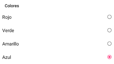
-
Events
- After Selecting
- This event runs after the user select an item from the drop-down list.
-
Procedures
- Display Dropdown
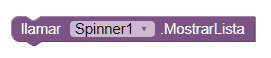
- With this method, we sample the drop-down list to select a element.
-
Properties
- Elements
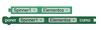
- This property returns a list of text items to choose from.
- String Elements
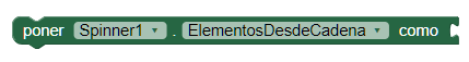
- Allows you to set the list of elements passed to the Spinner.
- Height
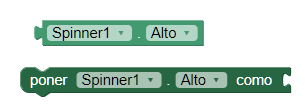
- Allows us to set the height of the Spinner.
- Height Percent
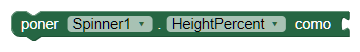
- Allows us to set the height in percentage of the Spinner.
- Width
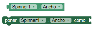
- Allows us to set the width of the Spinner.
- Width Percent
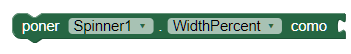
- Allows us to set the width in percentage of the Spinner.
- Prompt
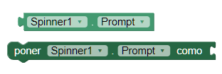
- Allows you to set the text with the current title for the window Spinner.
- Selected
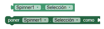
- This property returns the selected item as current in the Spinner.
- Selected index
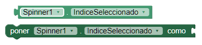
- This property returns us the index of the selected item currently, starting at 1. If no item is selected, the value will be 0.
- Visible

- Specifies whether the Spinner should be visible on the screen. The value is true if the component is showing and false if it is hidden.
-
Example
- Creating Spinner
This is a simple example, just use a small list of colors in the text to the Spinner and another to change the background color of the spinner.-
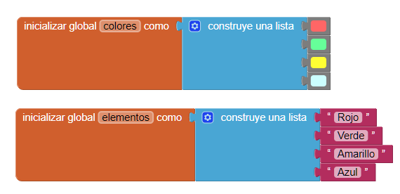
We load the list of colors to the spinner while initializing the display.-

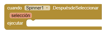
And finally we will use the event 'After select' to change the background color of the Spinner. Keep in mind that we should make two lists of the same size because we use the position of the item of the spinner to access the position of the color.-
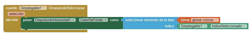
With these blocks so simple, we have created a spinner with the list of colors and when you select an item we change the color of the spinner.-
