Components
keyboard_arrow_up
Add
Image picker
-
Description
Image picker
The Image picker component is a button that when the user presses it, shows the gallery of images of the device and the user can choose an image of this. After selecting an image, it is saved and the property 'Selected Image' will have the address of the file where the image that was selected is stored.
In order not to fill the storage, a maximum of 10 images will be stored. To the select more images, the previous images will be deleted, in order of greater than higher. -
Events
- After picking
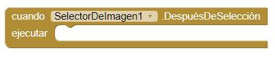
- This event is activated after there is activity in the selector, this returns its result in the 'Selected Image' property.
- Before picking
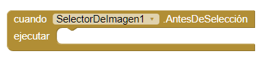
- This event is activated when the component is clicked, but before that the activity of the picker starts.
- Got focus

- This event is activated, when the cursor is over the button, It usually happens when we want to press the button.
- Lost focus

- This event is activated, when the cursor is no longer on the button.
- Touch down

- This event is activated, when we press the button down.
- Touch up

- This event is activated, when we stop pressing the button.
-
Procedures
- Open
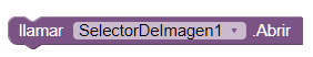
- This method opens the picker as if the user clicked on it.
-
Properties
- Background color
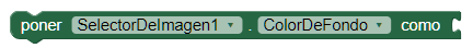
- Set the background color of the button.
- Enabled

- Allows you to set the button as activated or deactivated.
- Bold font
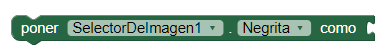
- Activate the bold print.
- Italic font
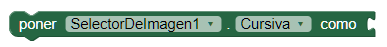
- Activate the letter in italics.
- Font size
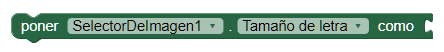
- Allows you to set the text size.
- Height
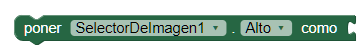
- Set the height in pixels.
- Height in percentage

- Set the height as a percentage.
- Width

- Set the width in pixels.
- Width in percentage

- Set the width in percentage.
- Image
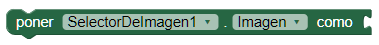
- Allows you to set an image on the button.
- Show feedback

- It establishes a visual effect to know that the button has been pressed.
- Text
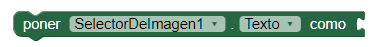
- Here we will write what will be shown on the button. You can leave it empty to show an image.
- Text color
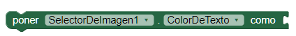
- With this property you can set a text color.
- Visible
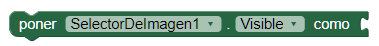
- Set the visibility of the button. It can be "Visible", to make it look the button or "Hidden" to hide it.
- Imagen seleccionada
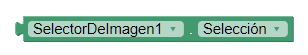
- It returns the path to the file that contains the image that is selected
-
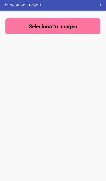
Example
- Image picker
- This example is very simple, we are only going to use the selected image to put it on the screen.
-
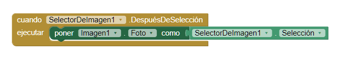
By clicking on the image selector, we will open our image gallery and choose one. The chosen image will be displayed on the screen.-