Table Layout
-
Description
- The Width of a column is determined by the component width in that column. To calculate the width of the column, the auto-wide is used for the components whose Width property is set as 'Adapt to'father'. However, each component will always fill the entire width of the column occupies. the
- The Height of a row is determined by the component highest in that row whose property 'Height' is not configured as 'Adapt to'father'. If a row contains only components whose properties Height are set as 'Adapt to' father', the height of the row is calculated using heights auto components.
Table Layout
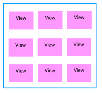
The component Layout in the Table allows us to visualize a group of components of a tabular form. This component is an element of format which places the components that are should be displayed in the form of a table. In the Arrangement in the Table, the components are arranged in a grille of rows and columns, with no more than a component visible in each cell. If multiple components occupy the same cell, only the last will be visible. Within each row, components they are lined up vertically in the center.
-
the
-
Properties
- Rows or number of rows
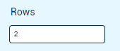
- To set the number of rows that have to table. This property we can configure in the properties of the component.
- Columns or number of columns
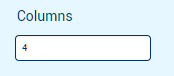
- To set the number of columns in a table. This property we can configure in the properties of the component.
- Heigh

- To set the height to the Horizontal layout.
- Height in percentage

- To set the height in percentage to the Horizontal layout.
- Width

- To set the width to the Horizontal layout.
- Width in percentage

- To set the width in percent to the Horizontal layout.
- Visible

- Specifies whether the component should be visible, as well as its content in the screen. The value is true if the component is showing and false if it is hidden.
-
Example
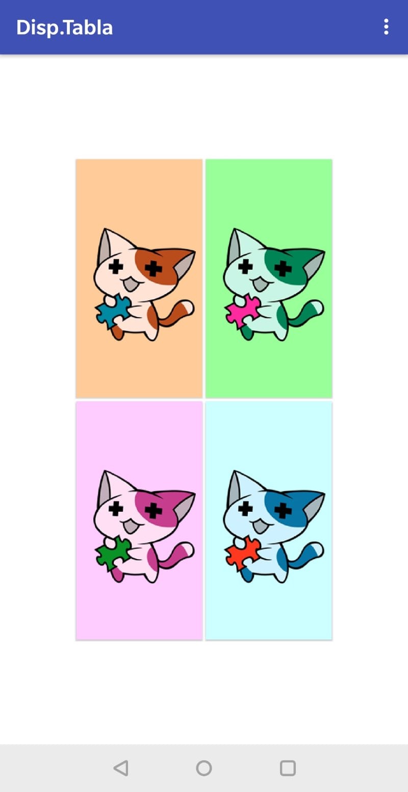
- Table Arrangement with images
- Make a table is very simple, we only have to add the component to the screen and configure how many rows and columns you will need. To do this we have to go to the properties of the component and put the value you want.
-
-
Once this is done, simply fill the cells with what they want, in this case we have used images.-
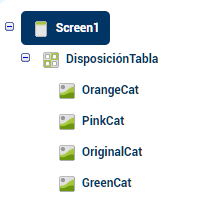
Getting a table with images.-