
Components
keyboard_arrow_up
Add
Slider
-
Description
Control deslizante
A slider is a progress bar that adds a thumb that can be dragged. You can touch your thumb and drag to the left or to the right to Set the position of the slider where I wanted.
As you drag the slider, it will trigger the event 'Position changed' and will inform the position of the slider. The position of the slider can be used to dynamically update another component attribute, such as the font size of a text box or the radio of a ball. -
Events
- Position changed
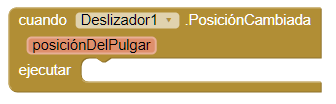
- Event that indicates that the position of the slider has changed.
-
Properties
- Width
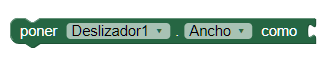
- It allows to set the width of the slider.
- Width in percentage
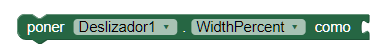
- It allows to set the width of the slider in percentage.
- Set maximum value

- Sets the maximum value of the slider. Changing the maximum value also resets 'Thumb position' so that it is at halfway between the minimum and the (new) maximum. If the new maximum is less than the current minimum, then the minimum and maximum are will establish in this value. Setting the 'Maximum value' resets the position of the thumb halfway between 'Minimum value' and 'Maximum value' and the event 'Position changed' is signaled.
- Set minimum value
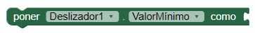
- Sets the minimum value of the slider. Changing the minimum value also resets 'Thumb position' so that it is at halfway between the minimum (new) and the maximum. If the new minimum is greater than the current maximum, the minimum and maximum will be established in this value. By setting 'Minimum value' the position of the thumb halfway between 'Minimum value' and 'Maximum value' and the event 'Position changed' is signaled.
- Left color
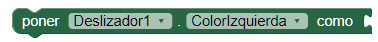
- Specify the color of the left part of the thumb of our control Sliding
- Right color
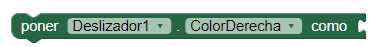
- Specify the color of the right part of the thumb of our control Sliding
- Thumb position
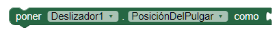
- Sets the thumb position of the slider. If this value is greater than 'Maximum value', will be set to the same value as 'Maximum value'. If this value is less than 'Value minimum ', will be set to the same value as' Minimum value'.
- Thumb enabled
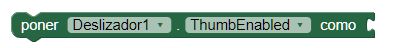
- Sets whether the slider is shown or not.
- Visible

- Specifies whether the component should be visible on the screen. The value is true if the component is displayed and false if it is hidden.