
Components
keyboard_arrow_up
Add
Card View
-
Description
Card View
A card view is nothing more than a provision (vertical, horizontal or scroll) with a Material Desing style, which we can configure to our liking.
-
Procedures
- Start Card View
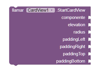
- This method allows you to configure the layout style that
let's choose If we use a roll-up provision, we must take into account that the
Background and height will be defined by the content of the arrangement.
The Targeted View component, allows us to modify all the dispositions that We want to use only a card view. Go to examples , to see it in more detail. - - Component: We will indicate on which component the card view. It has to be of the disposition type, we can choose between horizontal, vertical or scrolling.
- - Elevation: This property allows us to establish the shadow of Our card.
- - Radius: It refers to the radius of the edge of our card.
- - Padding: It will define the space between the content of our card and the card itself.
-
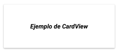
Example
- Adding several cards
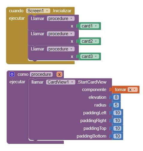
- As we can see, we only use a component of the type 'View Card '(CardView1) to modify the style of our dispositions. The 'card1' components. 'card2', 'card3' are vertical arrangements.
-
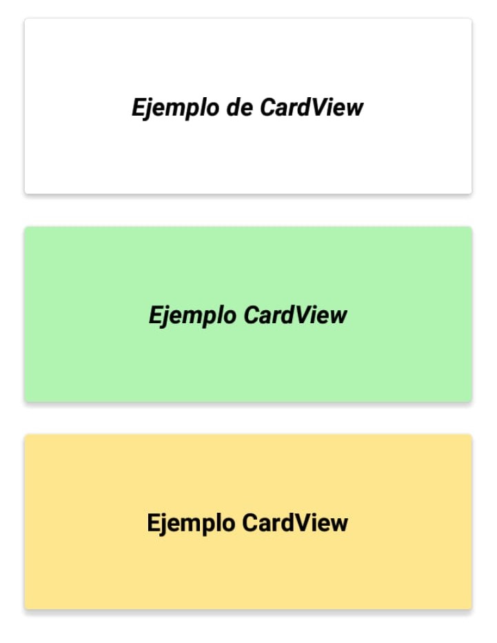
- Generating three vertical dispositions with Material Desing aspect.