
Components
keyboard_arrow_up
Add
Checkbox
- - Events
- - Properties
Index
-
Events
- Changed
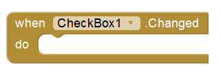
- This event reacts to a change in the check box.
- Got focus
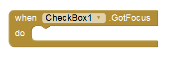
- This event is activated, when the cursor is over the check box.
- Lost focus
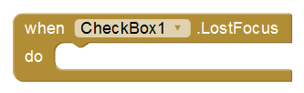
- This event is activated, when the cursor is no longer on the checkbox.
-
Properties
- Background color
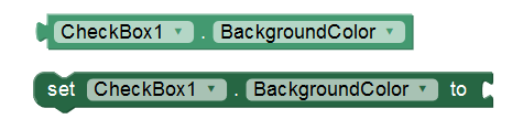
- Set the background color of the Check box.
- Checked
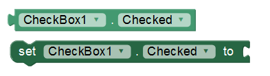
- Set the check box as checked or unchecked.
- Enabled
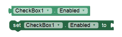
- Allows you to set the Check Box as enabled or disabled.
- Font size
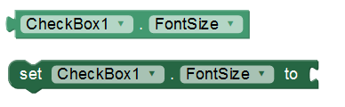
- Allows you to set the text size.
- Height
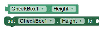
- Set the height in pixels.
- Height in percentage

- Sets the percentage height of the screen.
- Width
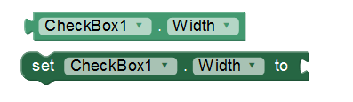
- Set the width in pixels.
- Width in percentage
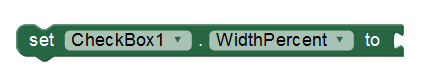
- Set the width in screen percentage.
- Text
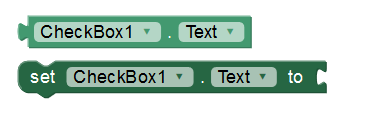
- Here we will write what will be shown in the checkbox. You can leave it empty to show an image.
- Text color
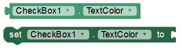
- With this property you can set a text color.
- Visible
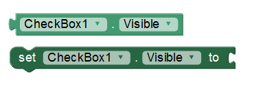
- Set the visibility of the check box. It can be "visible", to be seen or "hidden" to hide it.