
Components
keyboard_arrow_up
Add
Progress bar
-
Description
Progress bar
The progress bar component, allows us to add a bar with which to show the user a progress.
We can modify the % of load and the colors of the bar, both the bar that has already been loaded, and the part that still is not loading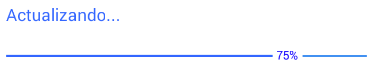
-
Properties
- Background color

- It allows to put a color for the background of the progress bar.
- Height
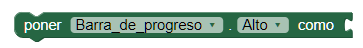
- Allows you to set the height of the progress bar.
- Height in percentage
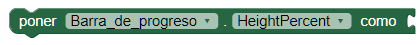
- It allows to set the height of the progress bar in percentage.
- Width

- Allows you to set the width of the progress bar.
- Width in percentage
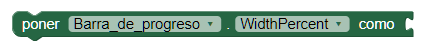
- Allows you to set the width of the progress bar in percent.
- Maximum value
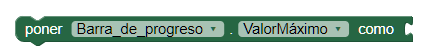
- Specify the maximum value of our progress bar.
- Reached color
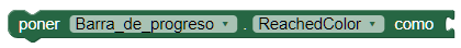
- Specifies the color that the bar that has already been loaded must have our progress bar.
- Unreached color
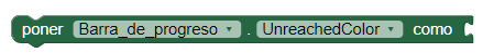
- Specifies the color that the bar must have that has not yet been loaded our progress bar.
- Set progress
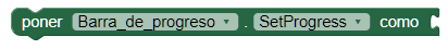
- Specify the progress value of our progress bar. For example, this value can be changed when certain procedures are executed or for time. Updating the value of our bar until it reaches the end.
- Font size
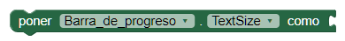
- If set, change the text size of the progress bar.
- Text color
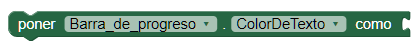
- It allows to change the color for the text of the progress bar.
- Visible
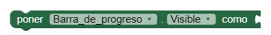
- Specifies whether the component should be visible on the screen. The value is true if the component is displayed and false if it is hidden.
-
Example
- Simple configuration
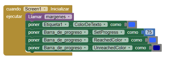
- We use the property 'Set progress' which will cause in this case
our bar is initialized at 75% and the two properties that
define the color of the progress bar.
Obtaining a progress bar with colour: