Components
keyboard_arrow_up
Add
Animated progress bar
-
Description
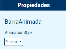
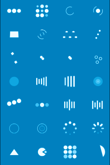
Animated progress bar
The animated progress bar component allows us to add an animation that it will be repeated until the progress ends. This component has many animations that we can use.
To select one we must go to the Properties of the progress bar animated and select the animation style.
-
Properties
- Background color

- Allows you to put a color for the background of the animated progress bar.
- Color
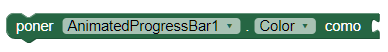
- It allows to put a color for the animation of the progress bar animated.
- Height
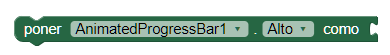
- Allows you to set the height of the animated progress bar.
- Height in percentage
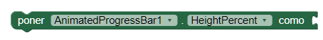
- Allows you to set the height of the animated progress bar.
- Width
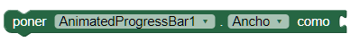
- Allows you to set the width of the animated progress bar.
- Width in percentage

- Allows you to set the width of the animated progress bar.
- Visible

- Specifies whether the component should be visible on the screen. The value is true if the component is displayed and false if it is hidden.
-
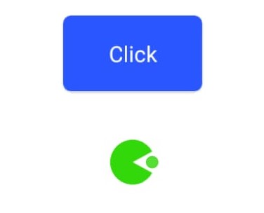
Example
- Animated progress bar with Clock.
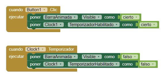
- Its use is very simple, we use the Event 'By clicking on a button' to make the animation visible. With the component 'Clock' we set the time with which it will be visible. After that time, the 'Clock' component will hide our animated progress bar.
-