
Components
keyboard_arrow_up
Add
Spacer
- - Description
- - Properties
Index
-
Description
Spacer
The Spacer component is a visible component, which allows you to create a lightweight View subclass that used to add Space (gap/padding/filler) between components.

-
Properties
- Height
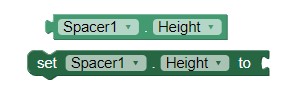
- Sets the height of the Spacer.
- Height Percent
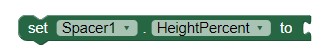
- Sets the height in percent of the Spacer.
- Width
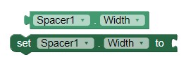
- Sets the width in pixels of the Spacer.
- Width Percent
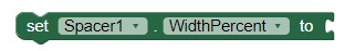
- Sets the width in percent of the Spacer.
- Visible
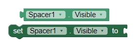
- Sets the visibility of the button. Can be "Visible", to see the button or "Hidden" to hide it.