
Components
keyboard_arrow_up
Add
Button
- - Events
- - Procedures
- - Properties
Index
-
Events
- On click
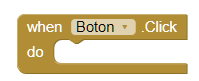
- This event is activated, when the user clicks on the button.
- On long click
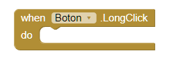
- This event is activated, when we press the button for about seconds.
- Get Focus
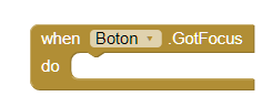
- This event is activated, when the cursor is over the button, It usually happens when we want to press the button.
- Lost Focus
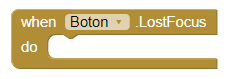
- This event is activated, when the cursor is no longer on the button.
- Touch down
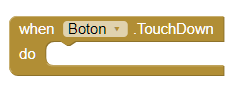
- This event is activated, when we press the button down.
- Touch up
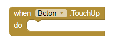
- This event is activated, when we stop pressing the button.
-
Procedures
- Do Click
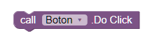
- This method allows us to click programmatically.
- Do long Click
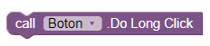
- This method allows us to do Long Click programmatically.
-
Properties
- Background color
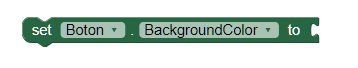
- Set the background color of the button.
- Enabled
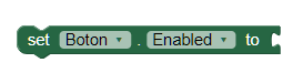
- Allows you to set the button as enabled or disabled.
- Bold font
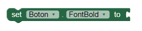
- Activates the letter in bold.
- Italic font
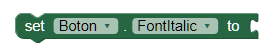
- Activates the letter in italics.
- Font size
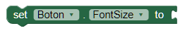
- Allows you to set the text size.
- Height
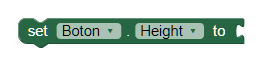
- Set the height in pixels.
- Height in percentage
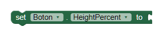
- Set the height in percentage.
- Width
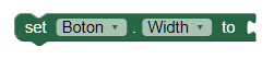
- Set the width in pixels.
- Width in percentage
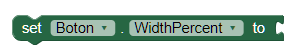
- Set the width in percentage.
- Image
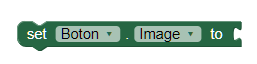
- Allows you to set an image on the button.
- Show feedback
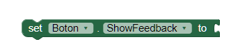
- It establishes a visual effect to know that the button has been pressed.
- Text
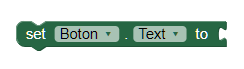
- Here we will write what will be shown on the button. You can leave it empty to show an image.
- Text color
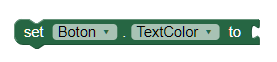
- With this property you can set a text color.
- Visible
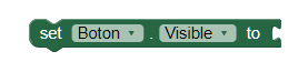
- Set the visibility of the button. It can be "Visible", so that the button or "Hidden" can be seen to hide it.